 Director Ian McCamey and I have done a lot of spots together, and when he calls I know he’s going to have some crazy fun idea that’s going to keep me up nights trying to figure out how to pull it off. That was certainly the case with our recent web spot for La Crema Winery (founded in 1979 and located in the Sonoma County, California wine country in Healdsburg, CA). Ian wanted to shoot the entire :30 piece in one take with three sets and two live costume changes.
Here’s the finished spot:
For my part I wanted to create lighting changes to help sell the set transitions, so I had to come up with a plan that afforded me both beautiful results and flexibility. My first step was to previsualize what I wanted the sets to look like, and based on some ideas Ian threw at me I came up with the following:
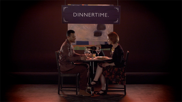
(1) The restaurant set. For some reason I always think of red in relation to restaurants. This might be because so many restaurants light their interiors with dim warm light, or lamps with red shades, or paint their walls red. It’s been shown that red not only stimulates the adrenal glands, making us hungrier, but it also makes us lose track of time–although I’m sure this has nothing to do with why we see red so often in restaurant interiors.
I had the choice of using red fill or red backlight. Red fill can make faces look ruddy, so I opted for red backlight instead. We had the choice of making it bright red or slight red, and in the end we opted for subtlety and mixed the red lights with white to desaturate them.
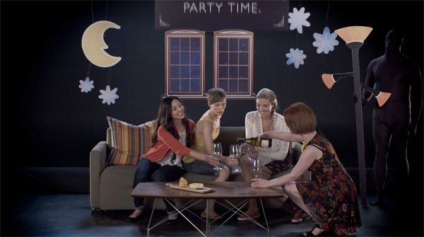
(2) The party set. Ian asked that the lighting be motivated by moonlight through the window, which to me said blue backlight and normal-colored fill.
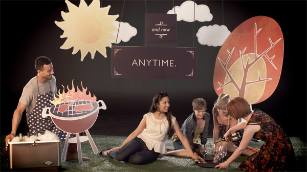
(3) The daylight BBQ set. Ian wanted a sunset look, and I toyed with the idea of making the backlight warm, but sometimes orange backlight looks more weird than sunny. Instead I opted to keep the backlight neutral and color the fill light, as if neutral sunlight were reflecting off warm straw or dirt. Colored fill can be subtle yet very convincing as shadows are rarely a neutral color: they are always illuminated by bounce light from some nearby object or surface that is rarely a perfectly flat white, and shadow color can act as a powerful trigger for mood.
To make all this work I asked my regular gaffer, Alan Steinheimer, to build a backlight arrangement that was controlled by dimmers and would offer me the most flexibility possible. We arranged clusters of three lights across the back wall and left one light in each cluster white while gelling the others blue and red respectively. Having a white light as part of each cluster meant that I could either use the red or blue lights alone or, if the color was too intense, mix in some white light to reduce the overall color saturation.
The trick was that the stage was going to be painted completely black, and although I asked for matte black paint I knew that paint is almost never free of shine. I expected all of my backlights to be visible as reflections in the surface of the floor.
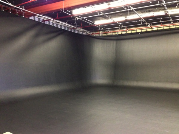
Starting with a blank black stage is every DP’s dream. Sort of.
I also wanted my backlight to wrap around the actors. For these reasons I asked my lighting/grip crew to bounce the backlights into two 4’x8’ pieces of foam core suspended from the ceiling at the back of the set. By blending these point sources into a large wide bounce source their reflection in the floor looked more like a wash instead of individual light sources, and the backlight wrapped nicely around the actors’ faces and reflected beautifully in their hair.
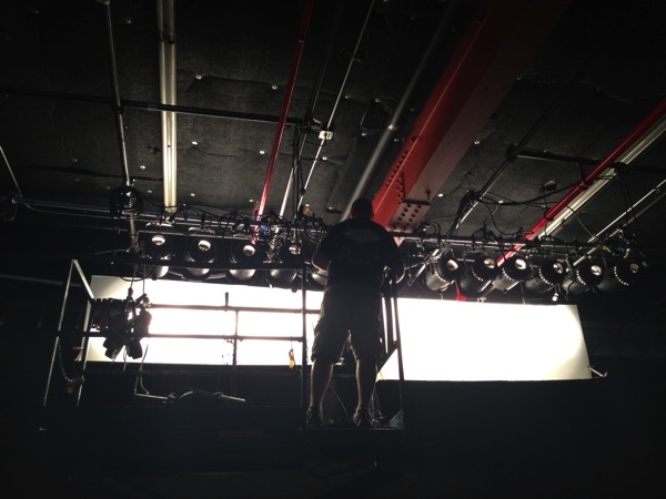
Best boy electric Ernie Kunze rigs my “wall of backlight.”
The front fill was provided by a 12’x12’ clay coat bounce to the left of camera and a smaller 8’x8’ clay coat bounce to the right. The 8’x8’ was lit only with white light and remained at a fairly consistent level of brightness while the 12’x12’ to the left was lit by either a white open-face 2K or a 2K gelled with full CTO and ⅛ minus green. (My experience has shown that CTO can tip over into yellow-green depending on the camera and the colorimetry so I automatically add a little bit of minus green gel to pull it back from that green edge.)
Last but not least we added two 2K fresnels as back crosslights as one of the actresses and a number of the stage hands were dressed entirely in black and needed a little extra punch to pull them out of the black background.
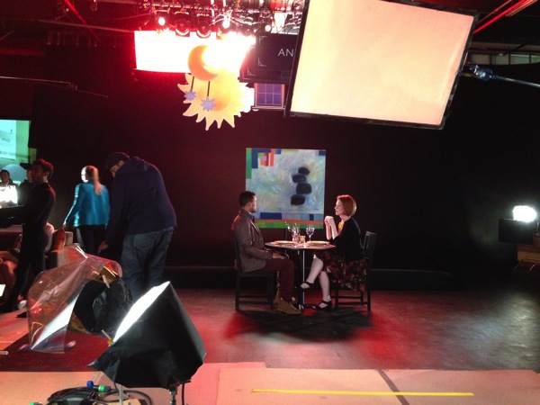
On the left are my two 2Ks, one with CTO and 1/8 minus green for the BBQ scene’s warm bounce fill and one clean for the other scenes. To the left and right of frame you can see the 2K fresnel scratch lights at the back of the set. The soft box overhead is a backlight for the final product shot.
We did have one last minute addition: the wine table sliding in at the end was not part of the original plan and it took a little bit to figure out how well we could light the glasses in that environment. The print layout we were trying to emulate was perfect in every way, but it was a still photograph where the glasses and bottles were photographed separately against a white background and then composited over black and placed together into the same image. Because of that the glasses looked very clean and free of busy reflections because they were all shot on their own. We didn’t have that luxury, and after puzzling over the shot on my lunch hour Ian and I decided that we weren’t going for perfection after all and let the glasses be what they would be. This worked out just fine. (The lighting for the glasses consisted of a large soft source from the side and a dedo light rigged overhead to light up the sign on frame right.)
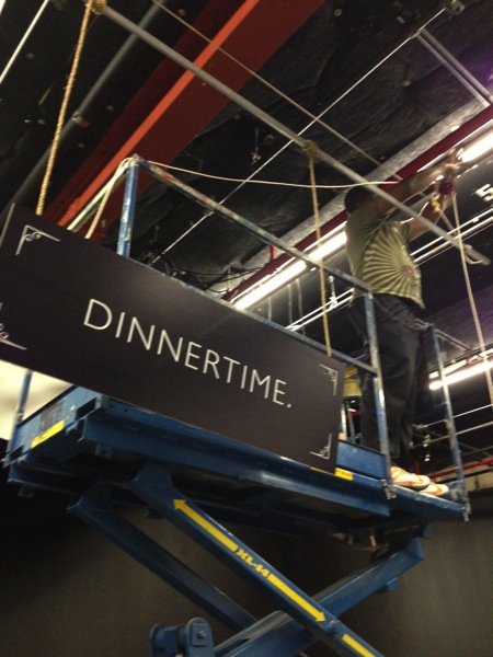
It took seven sets of pulleys to fly all the necessary set pieces and signs.
The light levels ended up being fairly low, and the set looked dim to my eye while looking fine on the monitor. I set the Sony F5 to my favorite hypergamma curve, HG7, which preserves a lot of highlight detail while opening up the shadows nicely. The lowest ISO the camera allowed me to use in this mode was 1600, so I rounded up to 2000 per Sony’s marketing literature. (Sony says this is a native ISO 2000 camera, and I found it to be about as noisy at 2000 as an Alexa is at ISO 800. I turned noise reduction up to “mid,” which is the default, to reduce the noise just a bit.)
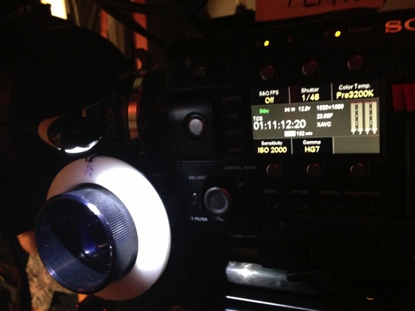
At ISO 2000 the set looked great on the monitor but really dim to my eye.
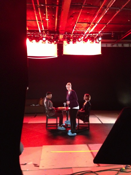
Producer Brittany Alejos keeps all of us moving on a tight schedule.
At ISO 2000 I still found myself shooting at T4, which is a pretty good stop for focus. When I was a camera assistant pulling focus on long lenses on TV series I discovered I could do almost anything at T4, so when possible that’s what I give my assistants. I did look briefly at a polarizer to eliminate the glare of the backlights off the floor, but found that I liked the glare because it gave the floor some character and created a sense of space around the actors. It was startling to realize that I had enough light to use a full polarizer in spite of the set looking underlit!
We shot this using Zeiss Super Speeds. I think we used a 35mm lens, which is a great all-around focal length: it’s not too wide but still creates a sense of volume.
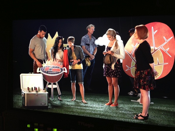
Gaffer Alan Steinheimer stands in the back of the set working on last-minute tweaks.
The lighting cues ended up being the easiest part of the production. Best boy electric and board operator Ernie Kunze took his own cues as the new set pieces dropped into frame. It only took us a rehearsal or two to get the lighting cues down, but it required 32 takes to get the action right. The actors really stuck with it, though, and with each take we got farther and farther through the action until they nailed it on take 31. Ian wanted a slightly faster take, though, and they managed to shave five seconds off their time with take 32.
For me as a DP this was a great example of setting everything up and then getting out of the way as it really was a theatrical performance. I’d stand by the monitor and look for anomalies that I thought diminished the take but otherwise I focused on making tweaks during the rehearsals and then letting everything take its course.
This was one of those spots where we all went in wondering if it would work, and–as we always do–we pulled it off with flying colors. It really is amazing to see something like this come together, and my crew performed spectacularly whether they were hanging lights or rigging pulleys.
Gaffer Alan told Ian and I after the shoot that this was the most complicated and fun shoot he’d had all year. That’s par for the course with Ian. I’m looking forward to our next impossible shoot!
About the Author

Director of photography Art Adams knew he wanted to look through cameras for a living at the age of 12. After spending his teenage years shooting short films on 8mm film he ventured to Los Angeles where he earned a degree in film production and then worked on feature films, TV series, commercials and music videos as a camera assistant, operator, and DP.
Art now lives in his native San Francisco Bay Area where he shoots commercials, visual effects, virals, web banners, mobile, interactive and special venue projects. He is a regular consultant to, and trainer for, DSC Labs, and has periodically consulted for Sony, Arri, Element Labs, PRG, Aastro and Cineo Lighting. His writing has appeared in HD Video Pro, American Cinematographer, Australian Cinematographer, Camera Operator Magazine and ProVideo Coalition. He is a current member of SMPTE and the International Cinematographers Guild, and a past active member of the SOC.
Art Adams
Director of Photography
www.artadamsdp.com
Twitter: @artadams
